
Integrate the Trustly UI
Create bank authorizations with Trustly UI
The Trustly UI is a web-based module that allows users to securely complete a bank authorization. Your application must successfully secure this authorization through the Trustly UI before you can use Trustly Payments or Data APIs.
SDKs and libraries
The Trustly UI is available for integration as a JavaScript library for web applications and as native mobile SDKs for mobile applications.
Mobile SDKs
See the following topics to start mobile development for your chosen platform or framework:
JavaScript Library
To integrate with a web application, include the Trustly JavaScript library on every page of your site. For example:
<script src="https://trustly.one/start/scripts/trustly.js?accessId={YOUR_ACCESS_ID}"></script>You must always load the script directly from trustly.one. Do not download, bundle or host the script from a custom domain. Replace YOUR_ACCESS_ID with the Access ID provided by Trustly during onboarding. If you're using the sandbox environment, adjust the subdomain to include sandbox
The following table lists the two primary functions the JavaScript library uses to manage the user authorization flow.
| Function | Description | Required Parameters |
|---|---|---|
| establish | Launches the Lightbox directly | EstablishData |
| selectBankWidget | Renders the Select Bank Widget | EstablishData, Options |
Implementation options
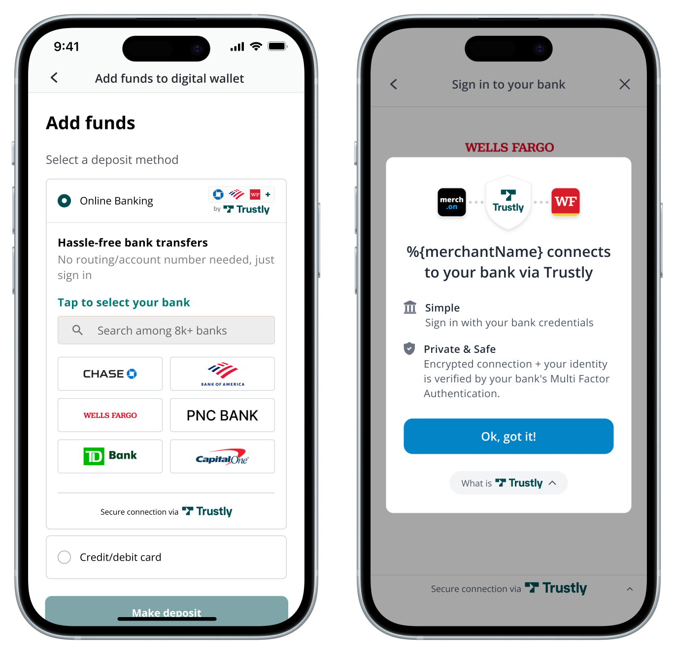
Trustly UI offers two user experiences you can configure to fit your application workflow. The options determine whether the user sees an in-line selection widget or a full-page lightbox upon initiating the flow.
When you implement the Select Bank Widget or the Trustly Lightbox you, must adhere to the Branding Requirements. If you have specific requirements, contact your Trustly team or email [email protected].
Select Bank Widget
The Select Bank Widget is an optional, in-line component that displays the most popular banks and provides a search field. Selecting a bank from the widget opens the Lightbox where the user authorizes their account.
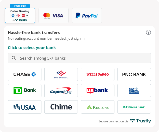
Launch the widget by calling the selectBankWidget function. The options parameter must include a widgetContainerId which specifies the ID of the HTML element that will contain the widget. For example:
let TrustlyOptions = {
  hideCloseButton: true,
  dragAndDrop: true,
  widgetContainerId: "trustly-widget-id" //Page element container for the widget
};

Trustly.selectBankWidget(establishData, TrustlyOptions);
Launch the Lightbox with a button
This method adds a button that a user taps to open the Trustly Lightbox and view a longer, scrollable and searchable list of banks.
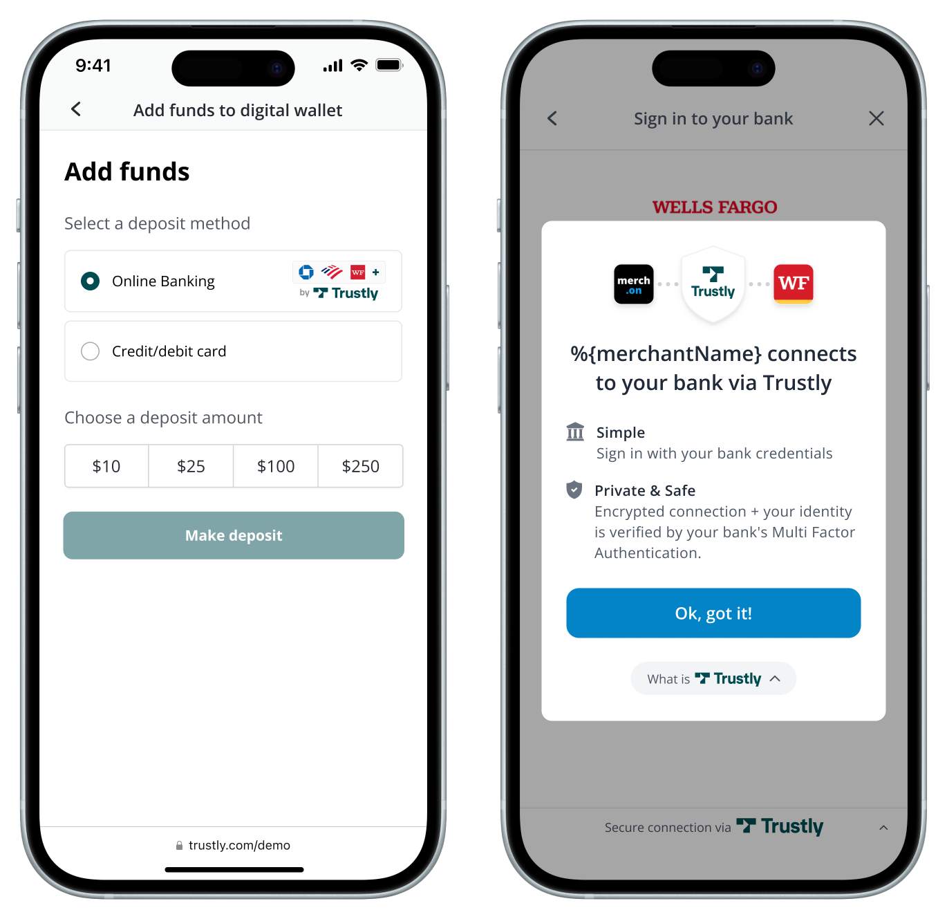
Launch the Lightbox by calling the establish function. For example:
Trustly.establish(establishData, options);Required data and configuration
The Select Bank Widget and the Lightbox require data to start the authorization process.
Establish Data object
Te following properties are always required in the primary data argument:
- accessId - string value associated with your API keys (provided by Trustly during onboarding)
- merchantId - string value associated with your API keys (provided by Trustly during onboarding)
- paymentType - string The payment transaction category your app requires. See Payment Types.
- returnUrl - Redirect URL to be called when a user successfully creates a bank authorization.
- cancelUrl - Redirect URL to be called when a user cancels from the Lightbox or the bank authorization is otherwise unsuccessful.
Example establish data object:
{
  "merchantId": "YOUR_MERCHANT_ID",
  "accessId":"YOUR_ACCESS_ID",
  "requestSignature": {requestSignature},
  "merchantReference": {unique_merchant_payment_identifier},
  "description": "any additional user-friendly descriptive information for the payment",
  "paymentType": "Deferred",
  "currency": "USD",
  "amount": "0.00",
  "customer": {
    "name": "Joe User",
    "email": "[email protected]",
    "address": {
      "address1": "2000 Broadway St",
      "city": "Redwood City",
      "state": "CA",
      "zip": "94063",
      "country": "US"
    }
  },
  returnUrl: "https://yourapp.com/path/return",
  cancelUrl: "https://yourapp.com/path/cancel"
}
Configuration options
You can configure the Select Bank Widget and Lightbox by passing optional properties into the options parameter. For example:
let TrustlyOptions = {
  hideCloseButton: true,
  dragAndDrop: true,
  widgetContainerId: "widget-id" //Page element container for the widget
};
The following table lists the configuration options you can specify in your request:
| Parameter | Description |
|---|---|
| hideBack | If specified and true, the Trustly Lightbox will hide the button ('<') that allows the User to go back from the Lightbox at any time. If false, the '<' button will be present. The default value is false. |
| hideCloseButton | If specified and true, the Trustly Lightbox will hide the close button ('x') that allows the User to close the Lightbox at any time. If false, the 'x' button will be present. The default value is false. |
| hideSelectBankBack | If specified and true, the Trustly Lightbox will hide the button ('<') that allows the User to go back from the Lightbox only on the Select Bank UI. If false, the '<' button will be present. The default value is false. |
| dragAndDrop | If specified and true, the user can drag the Trustly Lightbox. The default value is true. |
| widgetContainerId | For the selectBankWidget function, this will determine which page element is used to display the Trustly Widget. If the value is not set or is null, the Widget will be displayed inside the body element. The default value is null. |
Updated about 1 month ago