Product Presentation Playbook
Product Presentation Playbook
How to best use the Trustly Product Presentation Playbook:
The primary purpose of the (Product Presentation Playbook) PPP is to drive consistent, optimized merchant implementations.
- Implementation is categorized by levels – Standards: Platinum, Gold, Silver
- Each presentation standard has criteria that must be met to achieve it
- This Playbook provides details on each Standard and its associated criteria
Tutorial and Case Study content is included in the PPP to help drive alignment and understanding of the presentation standards
- Key elements include the Trustly Brand mark presence, and the relative position of Trustly in the merchant payment lineup
Additional PPP assets are available here.
How to maximize your Trustly benefits
To Maximize your Trustly Benefits, use the Product Presentation Standards in this Playbook, which guarantee:

- Ongoing alignment with best practices
- Highest conversion rate and share of checkout
- Compliance with our branding and legal requirements
*Under the Trustly full guarantee service
Implementation
Optimizing user adoption - key drivers and best practices
Naming, Mark, Banner - What is this payment method? How do I spot it rapidly?
- “Online Banking” + Mark/Banner
Placement, Endorsement - How visible and promoted is it?
Best in shopping cart: 1st in express checkout lineup or -
Best in general checkout: 1st + preselected in payment lineup
Benefit message - Why should I use it?
UX - How easy is it to use? 1 or 2+ clicks to bank sign-in
Best: Widget with bank tiles to select a bank and get to bank sign-in in 1 click
Tooltip - What is it in more detail?
Best: “Learn more” or “?” element with our product description
Incentive - Is there a (financial) benefit for me to use it? “More of your donation goes to UNICEF”
“Save $2 per bill payment (when you pay with Online Banking)”
Implementation - requirements & recommendations
1. Identify the best possible Product Presentation Standard for your site/app
Platinum > Gold > Silver
2. Follow the requirements & recommendations for your Standard
Hosted Assets
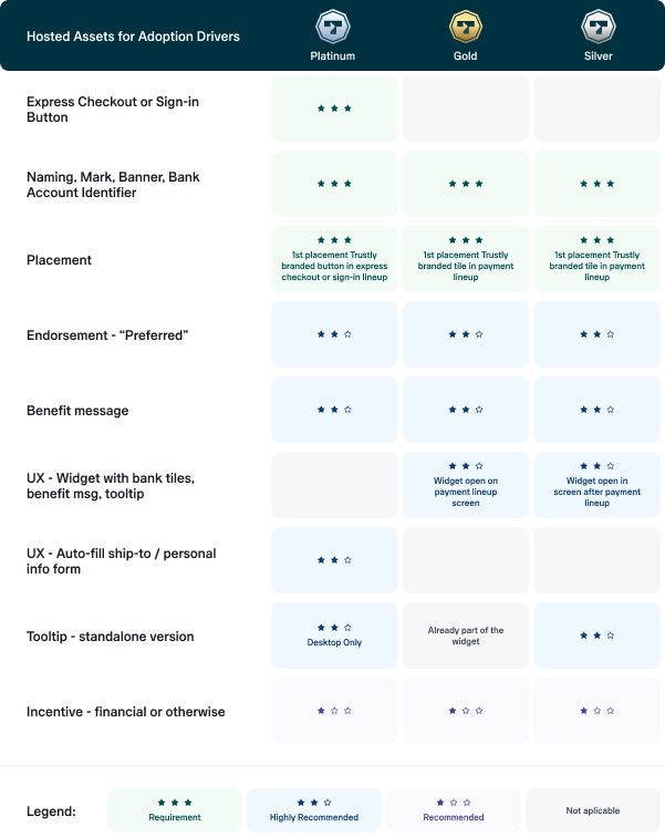
The Trustly hosted assets are trackable components that help merchants maintain our best practices for presentation standards and to keep adoption rates as high as possible. Using Trustly hosted assets is a requirement for certification and launch of your integration, so it is important to understand what the Trustly assets are and how they apply to your use case.
There are six categories of hosted assets:
- Payment Mark
- Widget
- Lightbox
- Buttons
- Content Strings
- Invisible Pixel
Payment Mark
See Mark library here.
Payment marks are hosted images representing the Trustly product in the merchant environment. That image is responsible for identifying Trustly as a payment method and is composed, in its entirety, of three elements:
- Online Banking (name of the product)
- Bank icons (recognition, reliability of banks)
- via Trustly (brand presence)
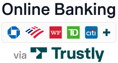
Trustly can manage the image the image that lives inside the URL and track impressions of it, allowing us to measure important KPIs such as adoption rate and also update merchants automatically with new assets.
How to use payment mark
Here are some different kinds of interfaces that we have integrated with and the recommendations below for each possible layout:
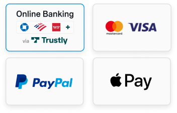
- Image only:
When all three elements have to be displayed as an image:
(image) Name - Online Banking
(image) Banks - bank icons
(image) Brand - via Trustly
Image only example:
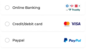
- Text + auxiliary image:
When one of the elements is text + space for smaller image:
(Text) Name - Online Banking via Trustly
(image) Banks - bank icons
(image) Brand - via Trustly
Text + auxiliary image example:
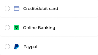
- Text only / Text + icon:
When we have only in-line text to display:
(text) Name - Online Banking
Text only / Text + icon example:
Do’s and Don’ts
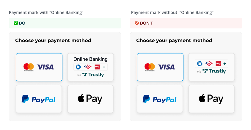
- Use the mark with “Online Banking” when dealing with an image-only payment method list:
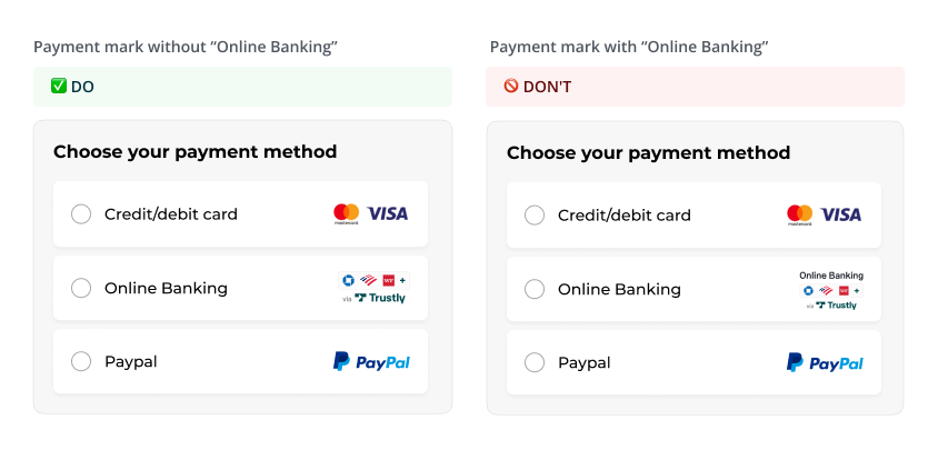
- Use the mark without “Online Banking” when the merchant use text to name the payment methods in a lineup:
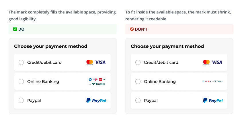
- Understand available real estate to maximize the visibility of the payment mark elements:
Widget
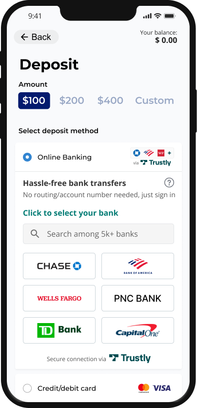
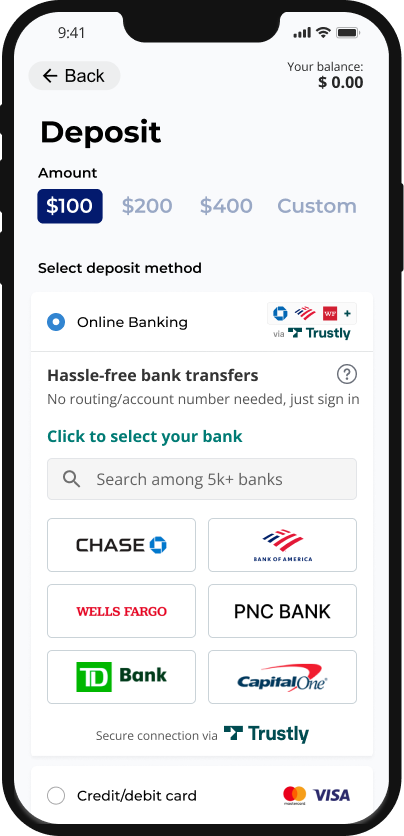
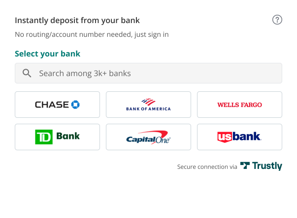
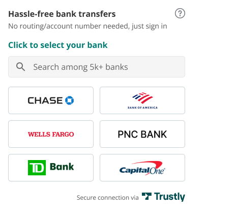
The Trustly Widget has selectable bank tiles for the most frequently used banks within your website or app. Presenting the Widget directly in the payment lineup creates a one-click user flow that drives maximum conversion.
JavaScript code (iframe) to embed in your page:
- Predefined size
- Predefined content:
-Naming
-Benefit message
-Service description for the “Learn more” element
-Bank Search utility
-Bank tiles, leading to ‘Sign in to your bank’ - To fit your environment precisely, you can configure:
-Font and font size
-The benefit message will be configured based on the other options in your payment lineup.
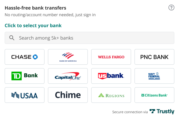
-Number of tiles—To drive conversion, choose the greatest number of bank tiles that work in your environment:
Default values for optimal conversion
- Desktop: 12 (3 rows x 4 columns)
- Desktop: 9 (3 rows x 3 columns)
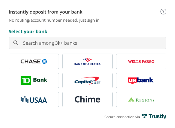
- Desktop: 6 (3 columns x 2 rows)
- Mobile: 2 columns with an even number of bank tiles to maintain a harmonious layout
Lightbox
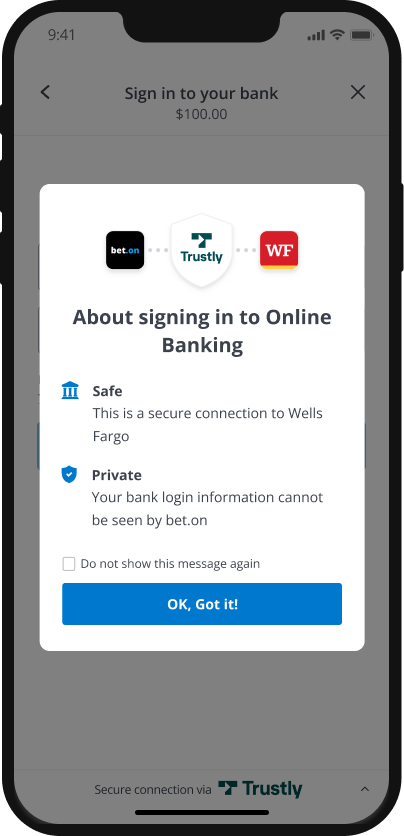
The Trustly Lightbox opens from the Widget (or from a call to action) for the user to authenticate by logging in to their selected bank and choosing the bank account they want to use.
The Trustly Lightbox is composed of:
1. Security slider:
Lightbox opens on the Security Slider upon user clicking on a bank tile/searching for a bank
- You can configure your logo/icon
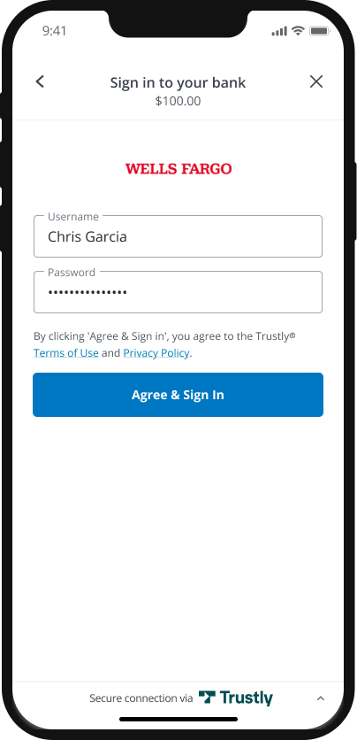
2. Sign in to your bank:
Bank-driven logic
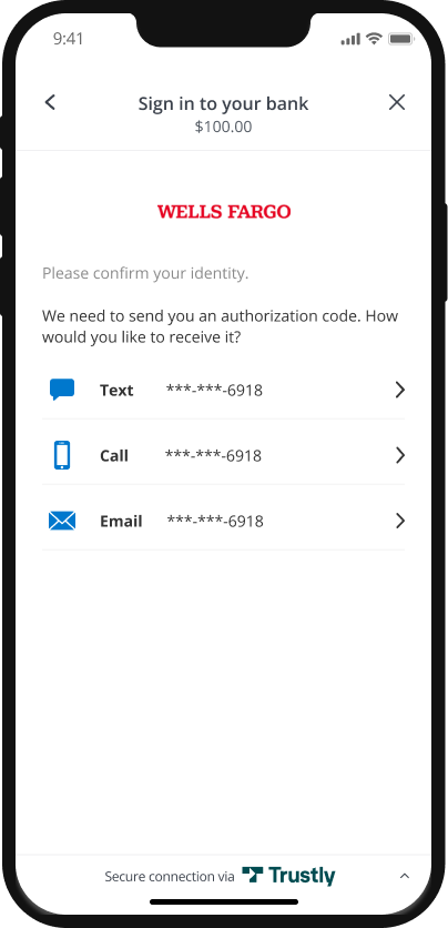
3. MFA
Bank-driven logic
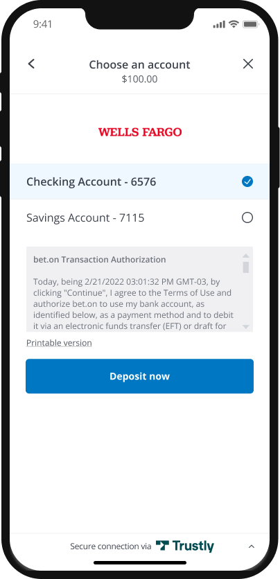
4. Choose an account:
- Version A: User is paying; hence NACHA authorization language
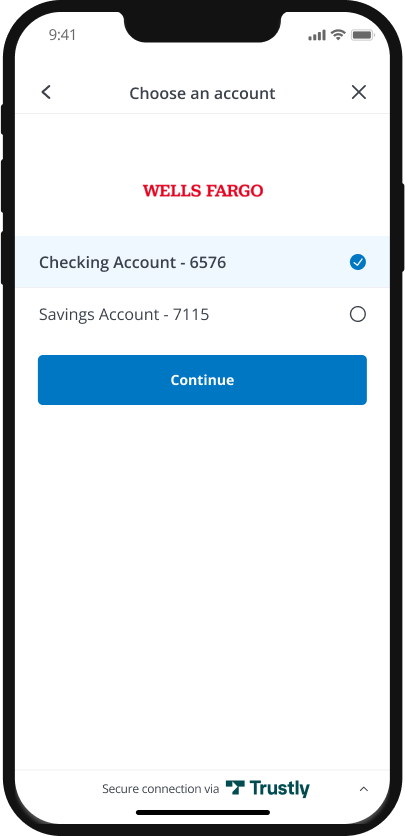
- Version B: User is onboarding an account into their profile on your site; hence no NACHA authorization language.
No “Amount” line anywhere in the account onboarding use case.
- Possible button labels for payments:
-Deposit
-Pay Now
-Deposit amount
-Pay amount
-Continue
Buttons
Certain scenarios require the use of a button to initiate the Trustly payment method, like Express Checkout. In these cases, Trustly provides branded buttons with service-specific messaging.
Trustly Express Checkout
Skip the checkout line! Presenting Trustly high in the funnel will reduce friction for users and help them checkout faster.

Trustly Sign-in
Sign-in with Trustly allows users to perform an action without first having to create an account on your site, reducing friction.

Account on file
Repeat, signed-in users who have already added a bank account to their profile on your site/app are able to pay with the same bank account without signing in to online banking again.
Our APIs for your order review and user profile pages:
- Transaction Info API: for showing the user’s bank account identifier
- Personal Info API: for pre-filling the user’s ship-to information
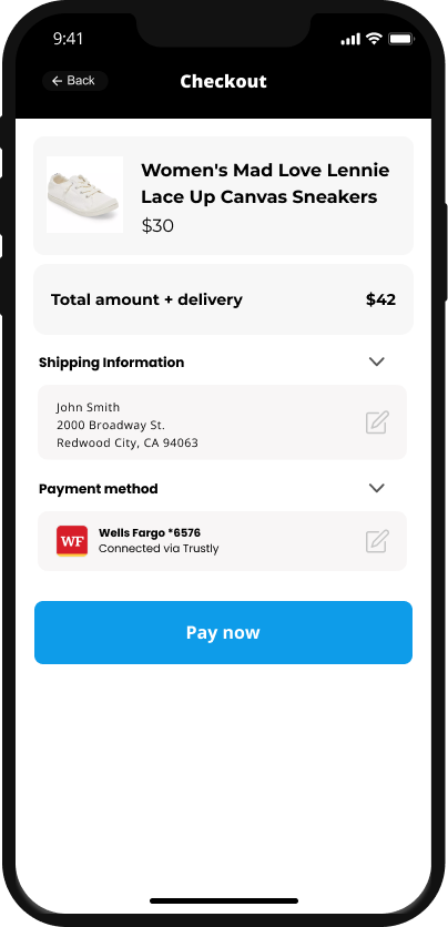
You must display the Bank name or logo and Bank Account name when displaying the method of payment used with the transaction. These details will come from a Trustly API.
- The Bank name can be retrieved using the transaction.payment.paymentProvider.name field in the Get Transaction API.
- The Bank logo can be retrieved using the transaction.payment.paymentProvider.paymentProviderId field in the Get Transaction API.
- The Bank Account name can be retrieved using the transaction.payment.account.name field in the Get Transaction API.
Content Strings
The Trustly content strings are trackable text strings that can display dynamic content based on the merchant needs. If Payment Marks are not available, the content strings are the next best to still guarantee a trackable asset and allows for UX optimization and reduced maintenance.
There are 5 different types of content strings:
- productName - Default is: Online Banking
- productTagline - Default is: Hassle-free bank payments
- bankSuffix - via Trustly
- tooltips.learnMoreData - Tooltip content for data merchants
- tooltips.learnMorePayment - Tooltip content for payment merchants
Invisible Pixel
If none of the recommended assets can be integrated, Trustly will allow using an invisible pixel to track impressions of the payment page. This is a 1x1 transparent pixel that works like any brand or payment mark. It will be an image inside a URL within your environment. It’s possible to set other parameters for tracking purposes through alternative methods should the need arise. Speak with the Trustly Solutions team or your Engagement Manager to configure unique implementations.
Product Presentation Standards
The primary purpose of the Product Presentation Standards is to drive consistent, optimized merchant implementations, which is is categorized by levels – Standards: Platinum, Gold, Silver.
Platinum

Platinum Standard offers a quick & frictionless method for making payments and connecting bank accounts. Read more about Platinum Standard
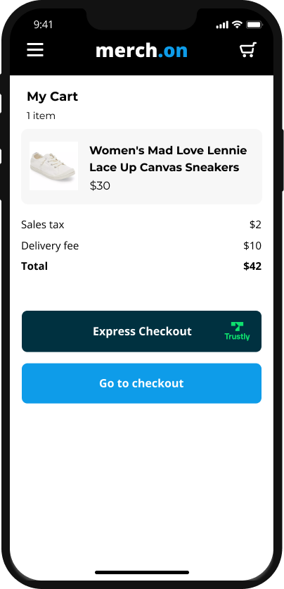
- The Express Checkout connects a user’s bank account to a merchant and automatically prefills the users shopping & billing information in the relevant fields. Ideal for online merchants who want to provide customers a fast & frictionless way to pay.
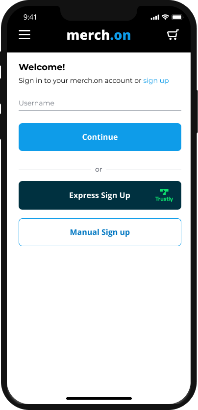
- The Express Sign In/Sign Up button connects a user’s bank account to a merchant. Once the user is signed in/signed up they can leverage the account saved on file for making payments, receive payments, or as needed. Ideal to support online sellers, rideshare drivers, and others who may also receive payment from a merchant.
Naming, Mark & Benefit Message
“Express Checkout” button, with Trustly logo next to it.
Placement & Endorsement
1st in express checkout lineup on shopping cart page
UX
Express checkout, whereby the user skips the shipping form and payment lineup, avoiding form-filling friction; shipping information is auto-filled on the ‘Review and confirm order’ page
Tooltip
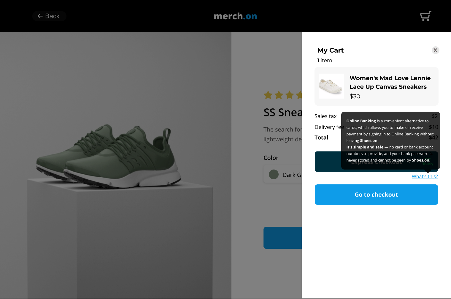
If real estate permits, “What’s this?”
Incentive
Consider in addition to the above
Express checkout example:
Express Sign Up example:
Hosted assets for your shopping cart:
Button for Naming, Mark & Benefit
Script to embed in your page
Tooltip
- If real estate permits, “What’s this?” below button
- Tooltip to describe our service (Express Checkout or Express Signup) and help the user understand how doing it with Online Banking is simple and safe.
- Show a hyperlink to open a pop-up window on click (mobile or desktop), or hover (desktop only)
- The Tooltip copy will be configured based on the use case and other options in your payment lineup.
Gold

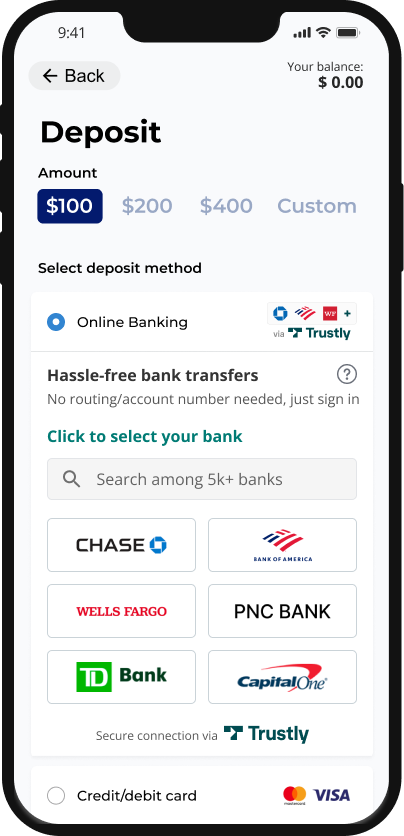
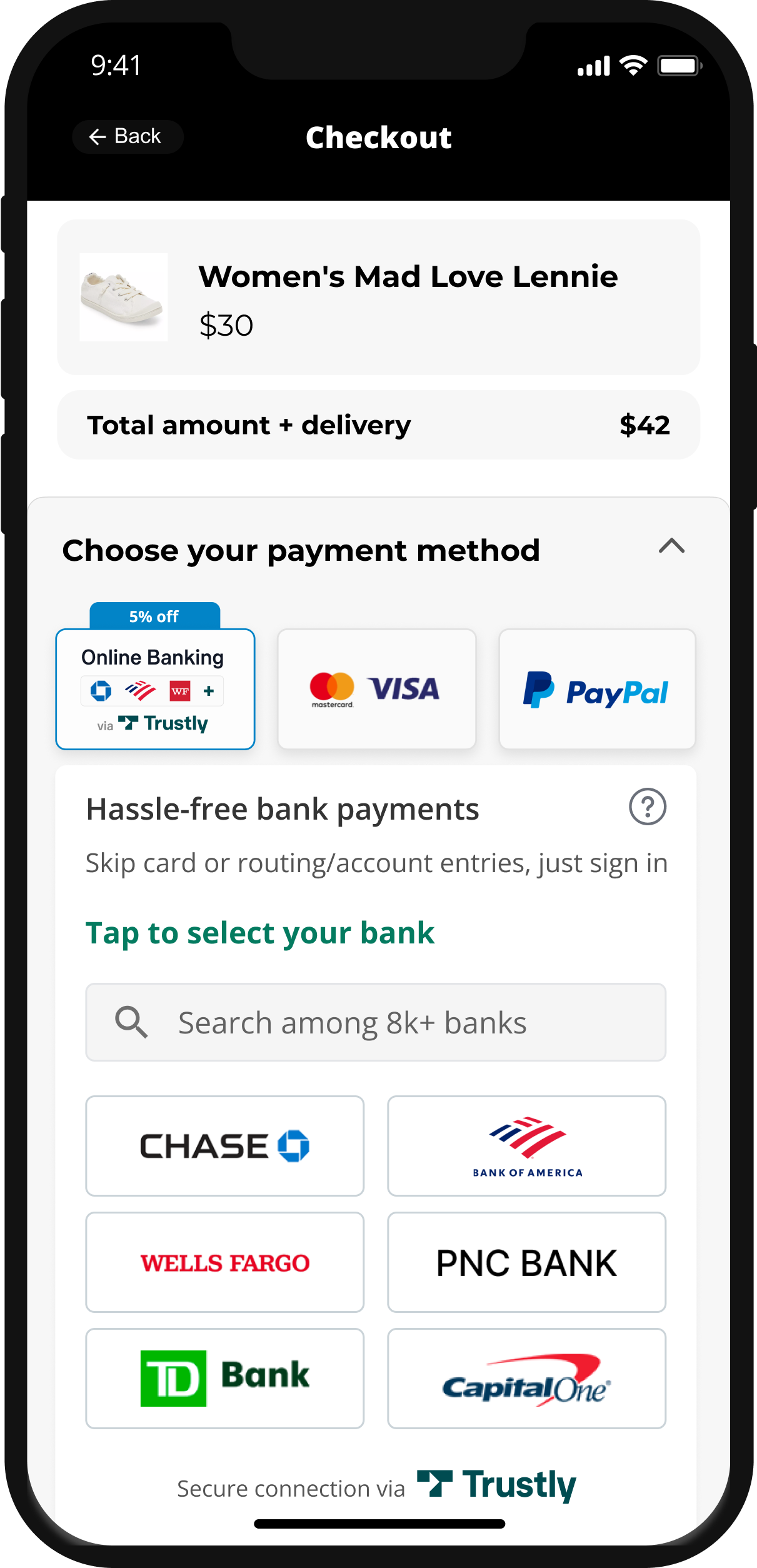
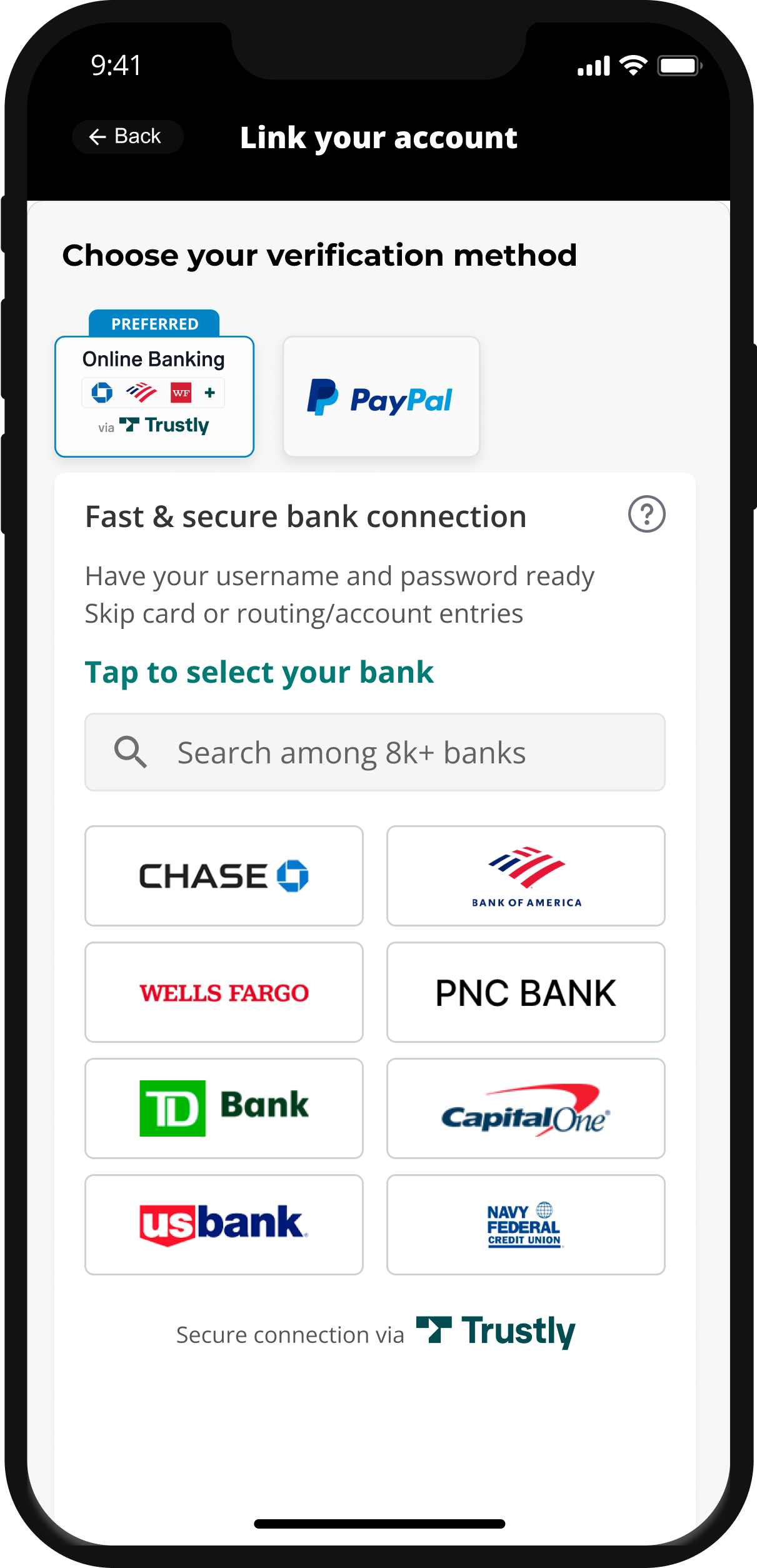
The Widget displayed in the payment lineup allows users to select their bank and login with just 1 click for making or receiving payments. Merchants can configure the widget environment to their liking – font, font size, number of bank tiles, benefit messaging. Read more about Gold Standard.
Naming & Mark
“Online Banking” + bank icons + Trustly logo - varying according to merchant UI
Placement & Endorsement
1st + preselected in payment lineup.
“Preferred” endorsement is highly recommended, but not a requirement
Benefit Message
Part of widget configuration for Gaming/Non-Gaming Payments/ Non-Gaming Data
UX
Widget on payment lineup page, enabling all users to select a bank and get to the bank sign-in without leaving the merchant
Tooltip
“Learn more” in Widget
Incentive
Consider in addition to the above
1-click Gaming example:
1-click Non-Gaming Payment example:
1-click Non-Gaming Data example:
Hosted assets for your payment lineup in general checkout:
Mark - for Naming & Mark
- Use a Payment Mark in your payment lineup & the Widget on the same page, 1st and preselected
- Choose hosted assets based on your real estate
Widget - for Benefit, UX, Tooltip
Implementation: Widget
Silver

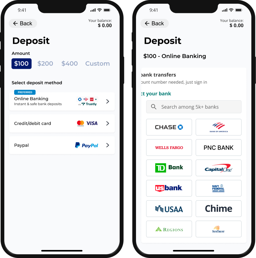
For payment lineups that don’t permit the enhanced Widget experience, Silver placement is a great option. With just 2 clicks users can login to their bank, and make or receive payments directly from their bank account. Merchants can configure the widget environment to their liking – font, font size, number of bank tiles, benefit messaging. Read more about Silver Standard.
Naming, Mark & Benefit Message
Single or separate “Online Banking” element + “bank icons” element with built-in benefit message
Placement & Endorsement
1st position. “Preferred” or “Recommended” endorsement is highly recommended, but not a requirement.
UX
Widget not on payment lineup but on next page, so 2 clicks required to select a bank and get to the bank sign-in
Tooltip
If real estate permits, “Learn more” below “Online Banking” option
Incentive
Consider in addition to the above
2-clicks Gaming example:
2-clicks Non-Gaming Payment example:
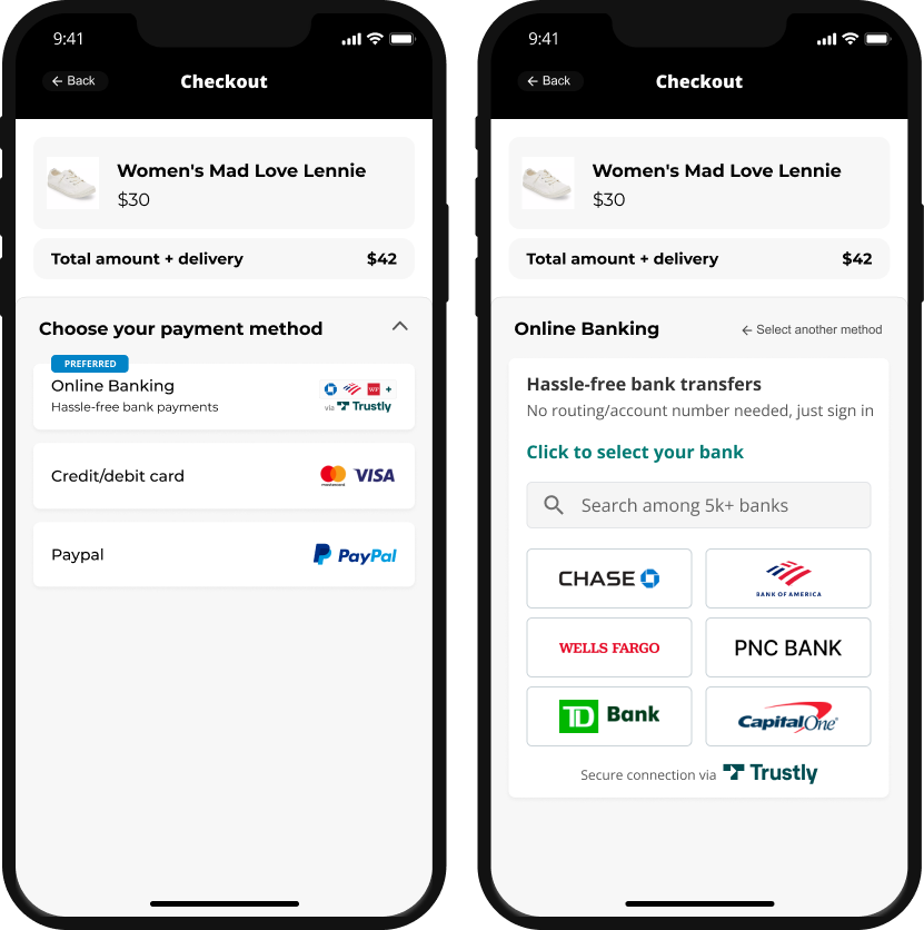
2-clicks Non-Gaming Data example:
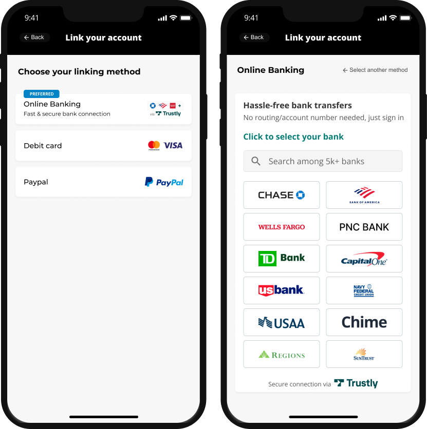
Our hosted assets for your payment lineup in general checkout:
Mark or Banner: for Naming, Mark & Benefit.
- Choose hosted assets based on your real estate- If real estate/structure do not permit, use naming + benefit message as a text string
- Always aim to display the benefit message in the payment line up page, when possible
Benefit message: Can be used with the image or as a content string.
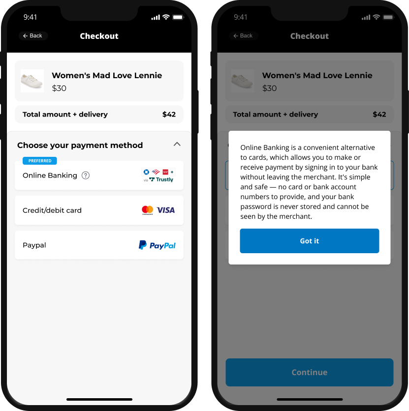
Tooltip: To describe our service and help the user understand how paying with Online Banking is simple and safe
- Show a hyperlink to open a pop-up window on click (mobile or desktop), or hover (desktop only)
- The Tooltip copy will be configured based on the other options in your payment lineup. If real estate permits, apply “Learn more” below or next to “Online Banking” option on payment lineup page.
Silver Tooltip example:
Widget - for Benefit, UX, Tooltip
Implementation: Widget
Additional Services
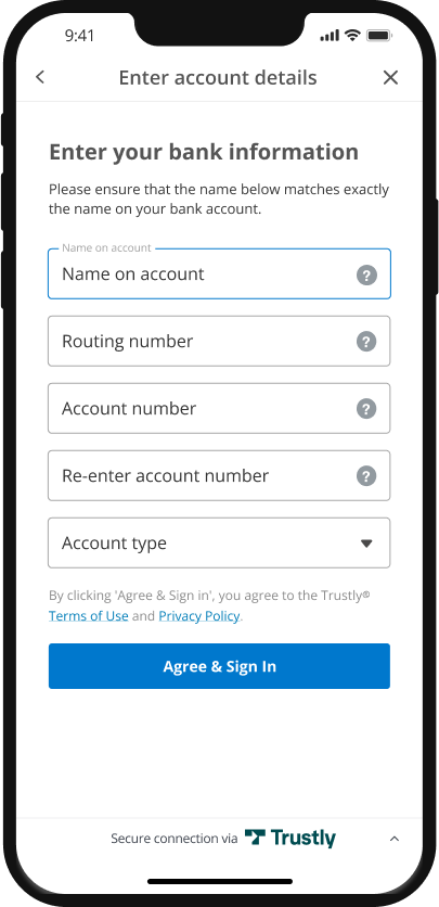
Service 1: (MEC) Manual Electronic Check
“eCheck” alternative to Online Banking Payment flow—if user’s bank is not enabled
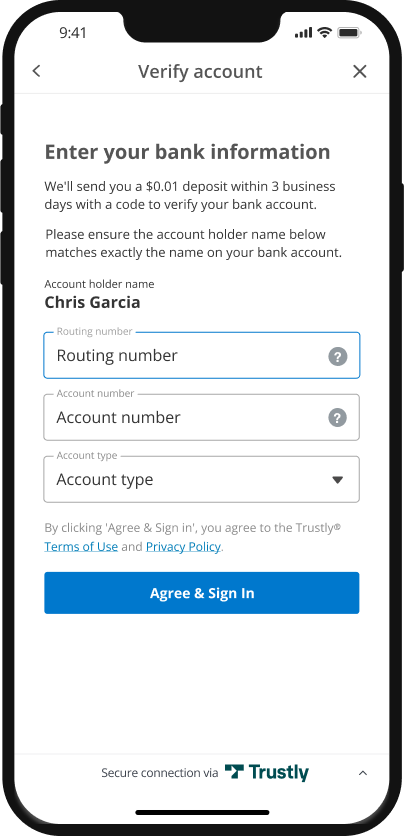
Screen 1: Click on: “Enter account manually”.
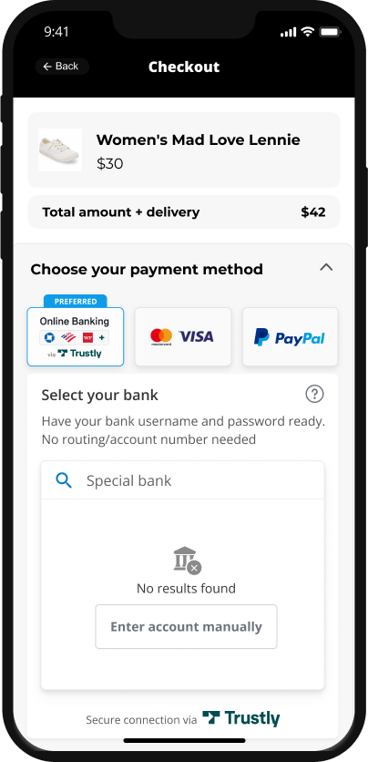
Screen 2: Enter your bank information.
Service 2: (MCD) Manual Challenge Deposit Verification
“Micro-deposit” alternative to Online Banking Verification flow—if user’s bank is not enabled
Screen 1: Click on: “Enter account manually”.
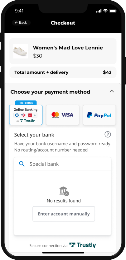
Screen 2: Enter your bank information.